The Challenge
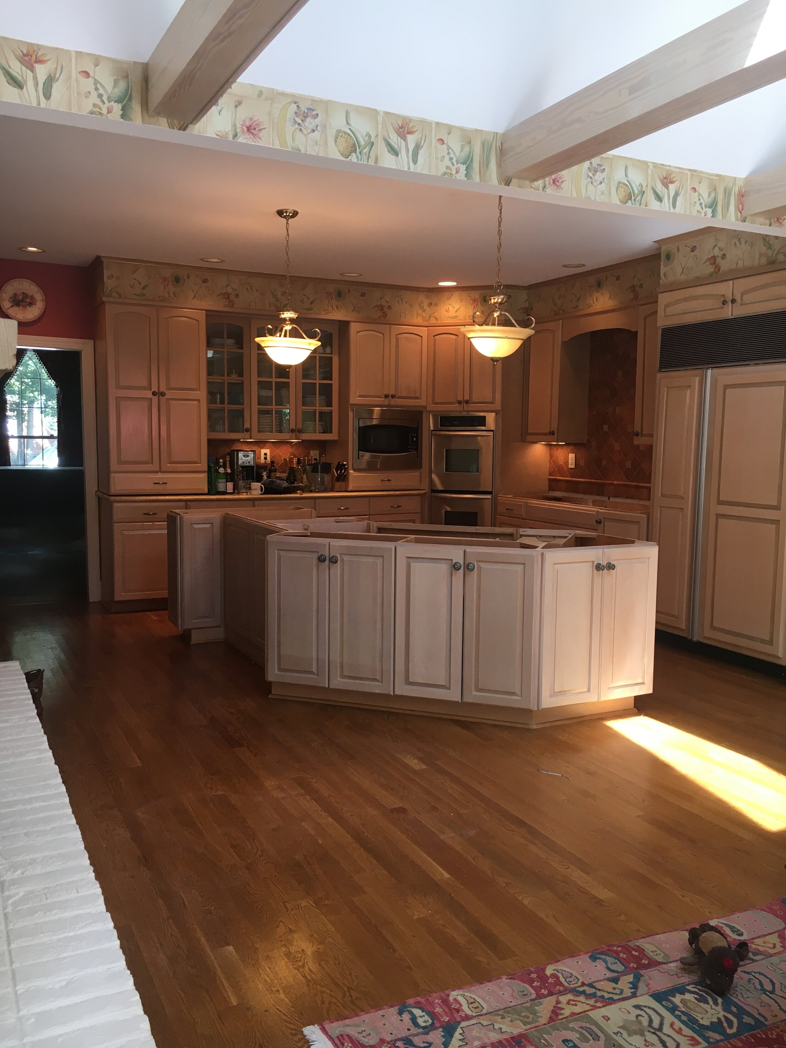
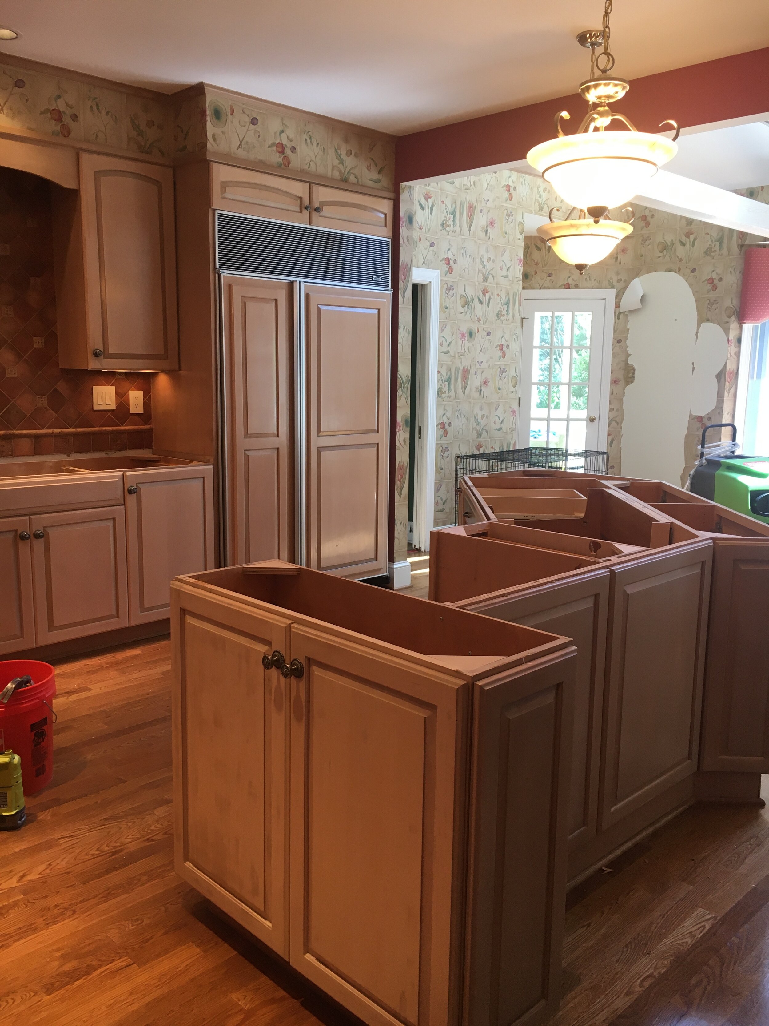
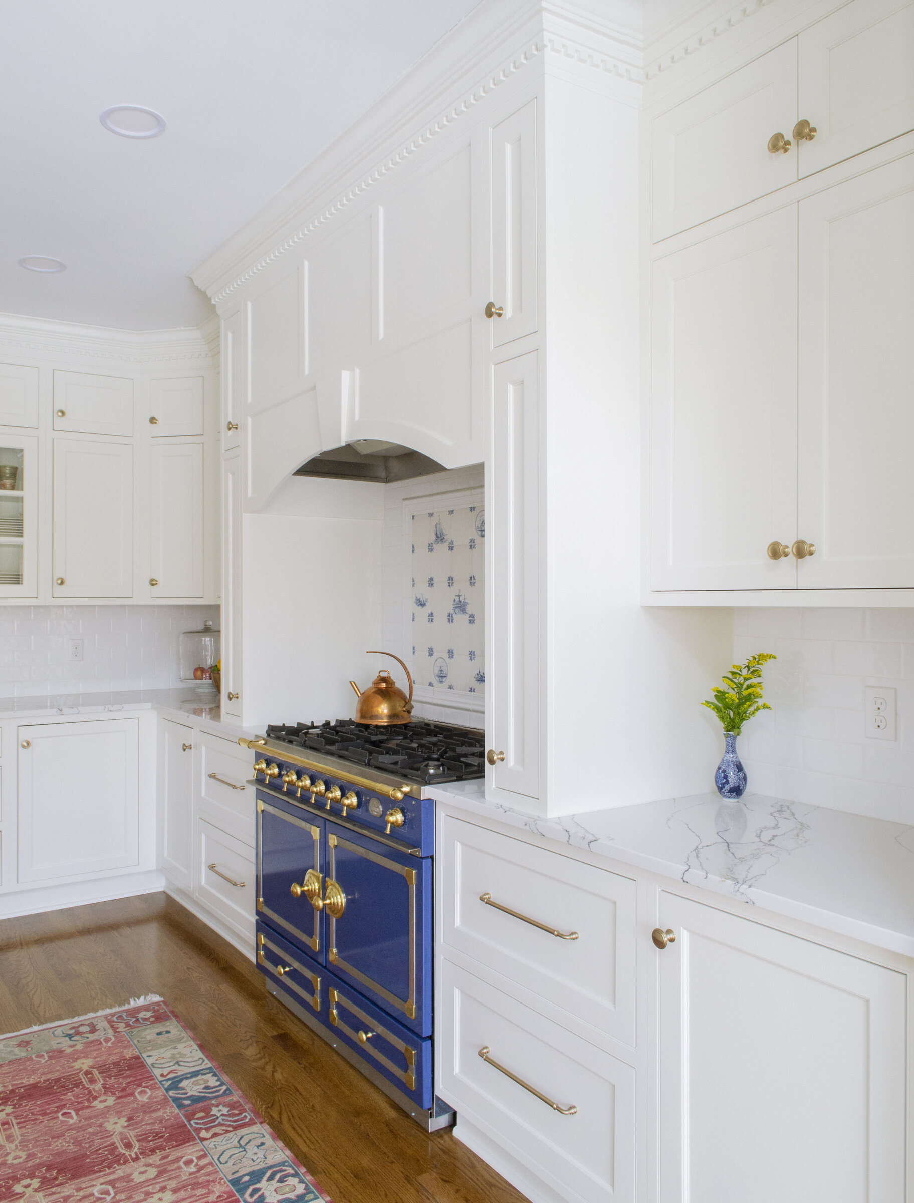
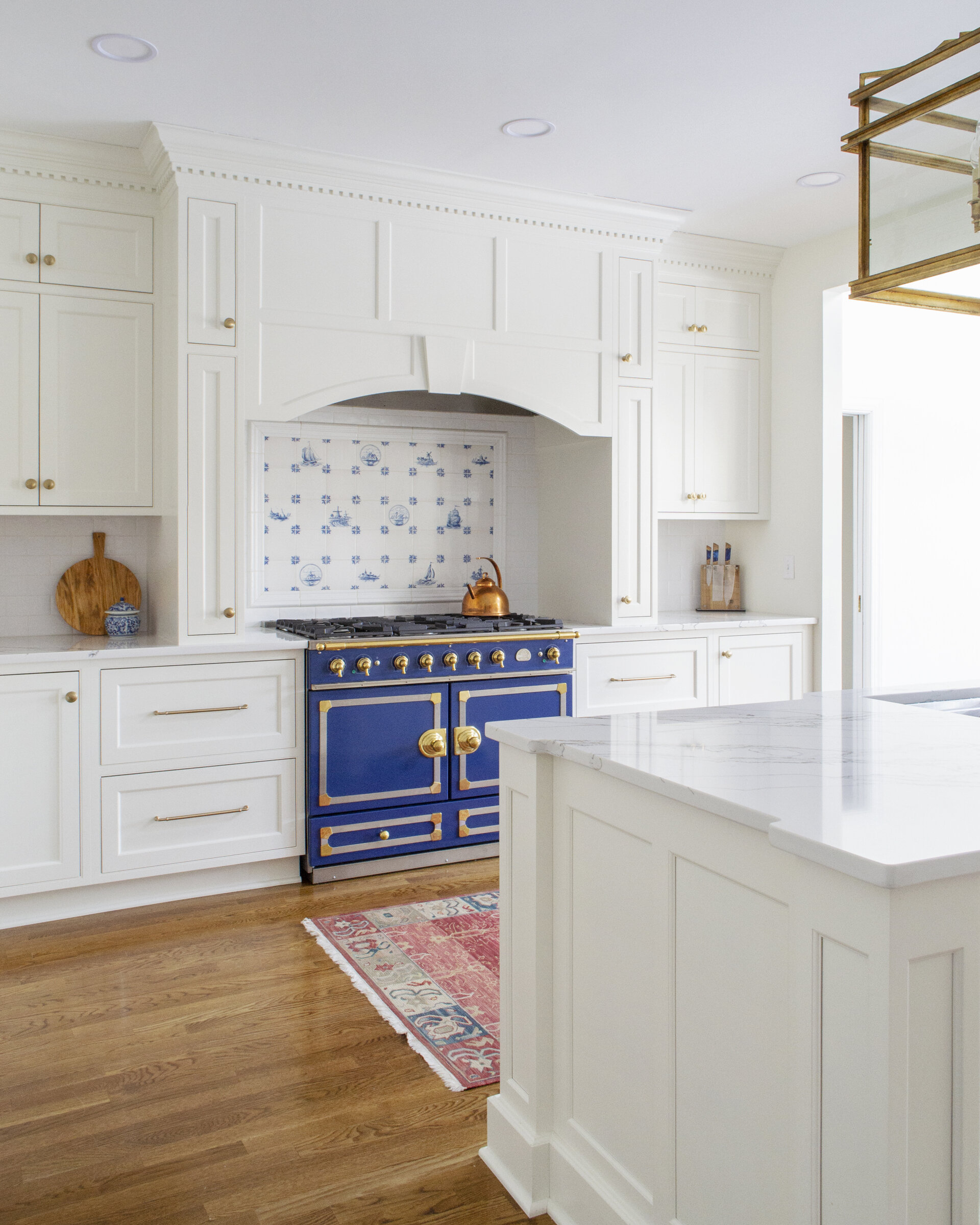
Just after moving in, these homeowners took their dog on a quick walk- and came back to a kitchen sitting in 5” of water. Seizing control of the situation, they opted to transform their kitchen into the space of their dreams. While there were features in the original kitchen that drew them to the house, they knew a few shifts would need to be made in order for it to be as functional as possible. The homeowners had fallen in love with a La Cornue range, and wanted to make it the focal point of their kitchen, so a layout shift was necessary, as well as a palette refresh to match the rest of their new home.
The Solution
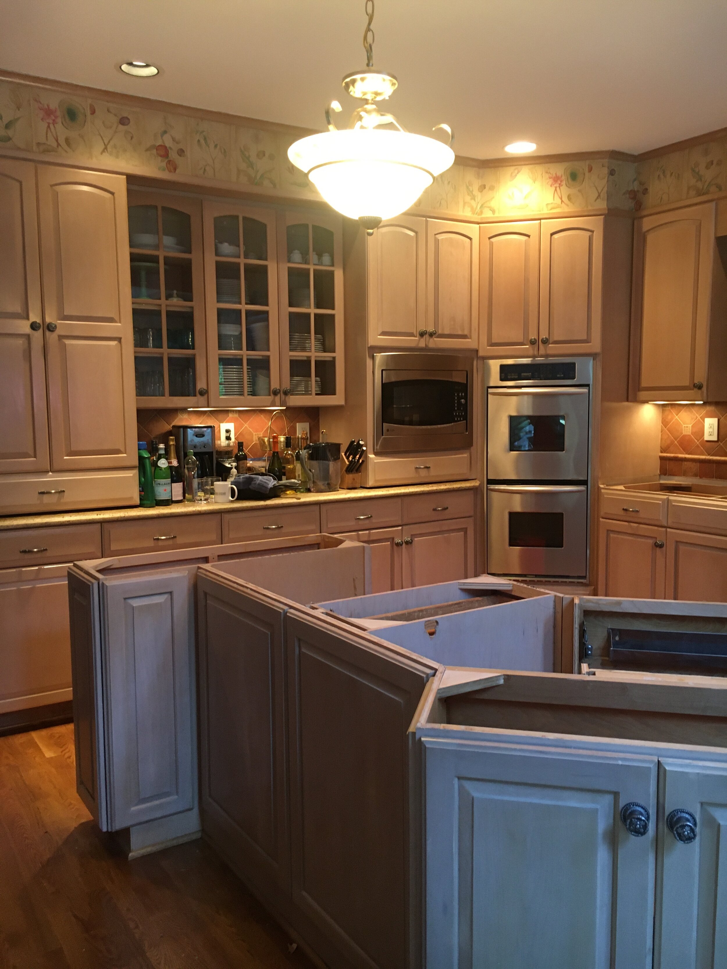
While the homeowners loved how the kitchen flowed into the other areas of their home, the original kitchen was severely lacking in counterspace. A built-in microwave and a hutch sitting on top of the counter as well as a corner oven made the remaining counterspace choppy, and left little space for prep. Since the wall that the fridge was formerly on was the longer part of the L-shaped perimeter, moving it to the opposite end was a purposeful decision to accommodate the range. Not wanting to get the homeowners in the same issue as before, their designer, Melissa, was cognizant of the amount of counterspace on either side of the range, especially since the homeowners wanted a hearth-style hood. The layout shifts keep the perimeter open as the utilitarian side of the kitchen, while the island is free to be the social hub.
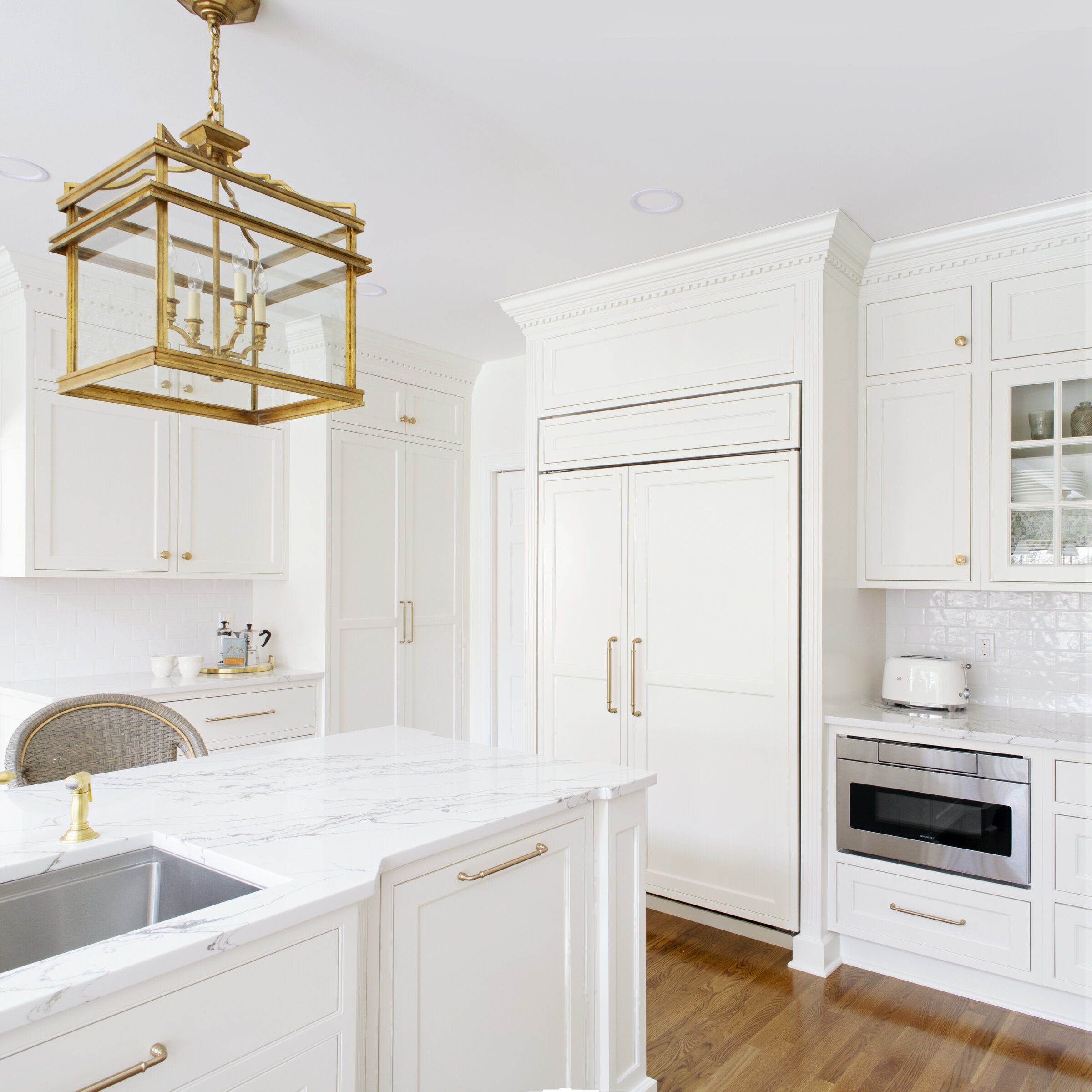
Tucked just beyond the fridge, a coffee bar accompanied by a pantry cabinet completes the footprint of this kitchen. This area is perfect in the mornings, the first stop for every member of this sweet family, whether it be reaching for coffee or grabbing cereal from the cabinet.
The French and European motifs are what drove the design of this kitchen. The simple inset cabinetry is beautiful, but allows the flashier details to do the real talking. From the fluted columns surrounding the fridge to the dentil molding dressing up the crown, every aspect of this kitchen exudes timeless beauty. Rather than feeling cold, the all white cabinets keep the space airy and open, despite having 4 foot high wall cabinets. Nothing about this kitchen feels heavy or overdone, but rather like a space where you can feel instantly at ease as you walk in.
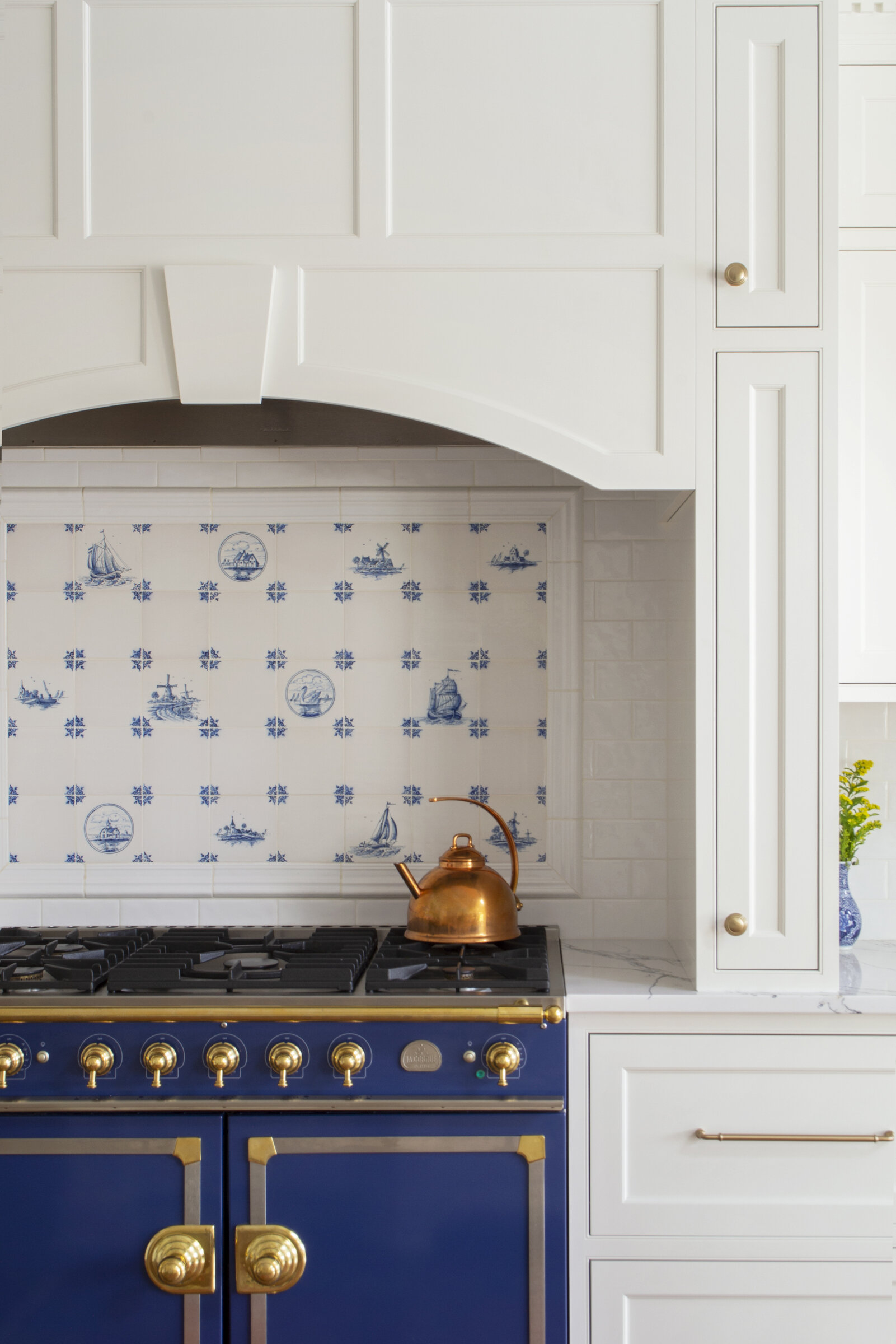
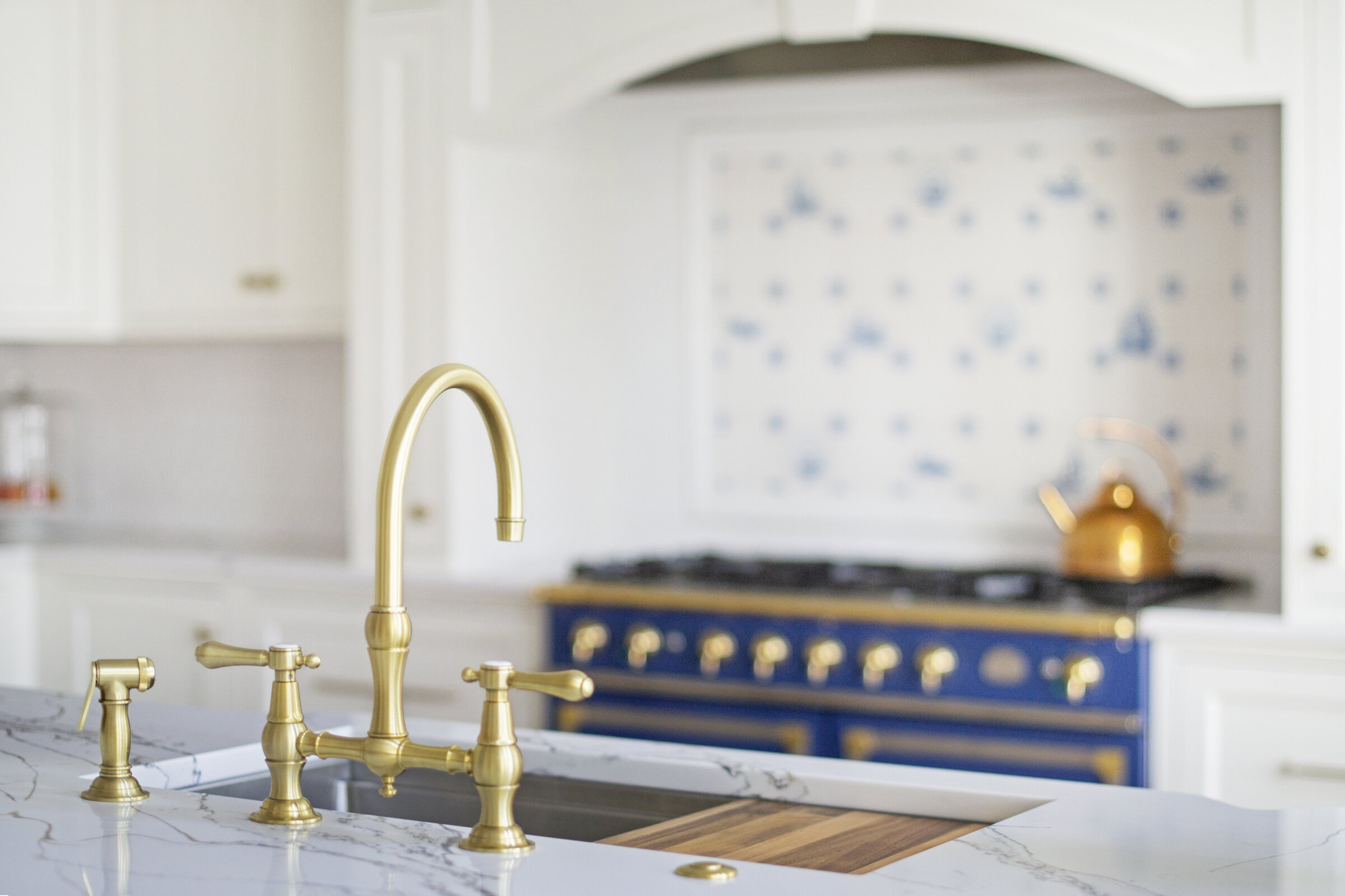
The blue and gold of the CornuFé range was carried to the hardware, faucet, lighting, accent tile, and of course, accessories. The hand painted tile behind the range was made in Holland, and is adorned with various types of ships similar to the toile pottery accenting the kitchen. The hearth style range in itself is quintessentially European, with many older European homes having their range set into an alcove in the wall. Both practical and beautiful, it is the perfect counterpart to the showstopper of a range.
In a kitchen of this size, it’s easy for things to be misplaced and disorganized. Having installed accessories is the perfect answer to this problem. The pull-outs on either side of the range keep all your spices and cooking oils close at hand, while the hidden roll-outs offer an extra layer of organization. Most of the base cabinets have roll out shelves as well, which ensure full extension storage throughout the entire space.
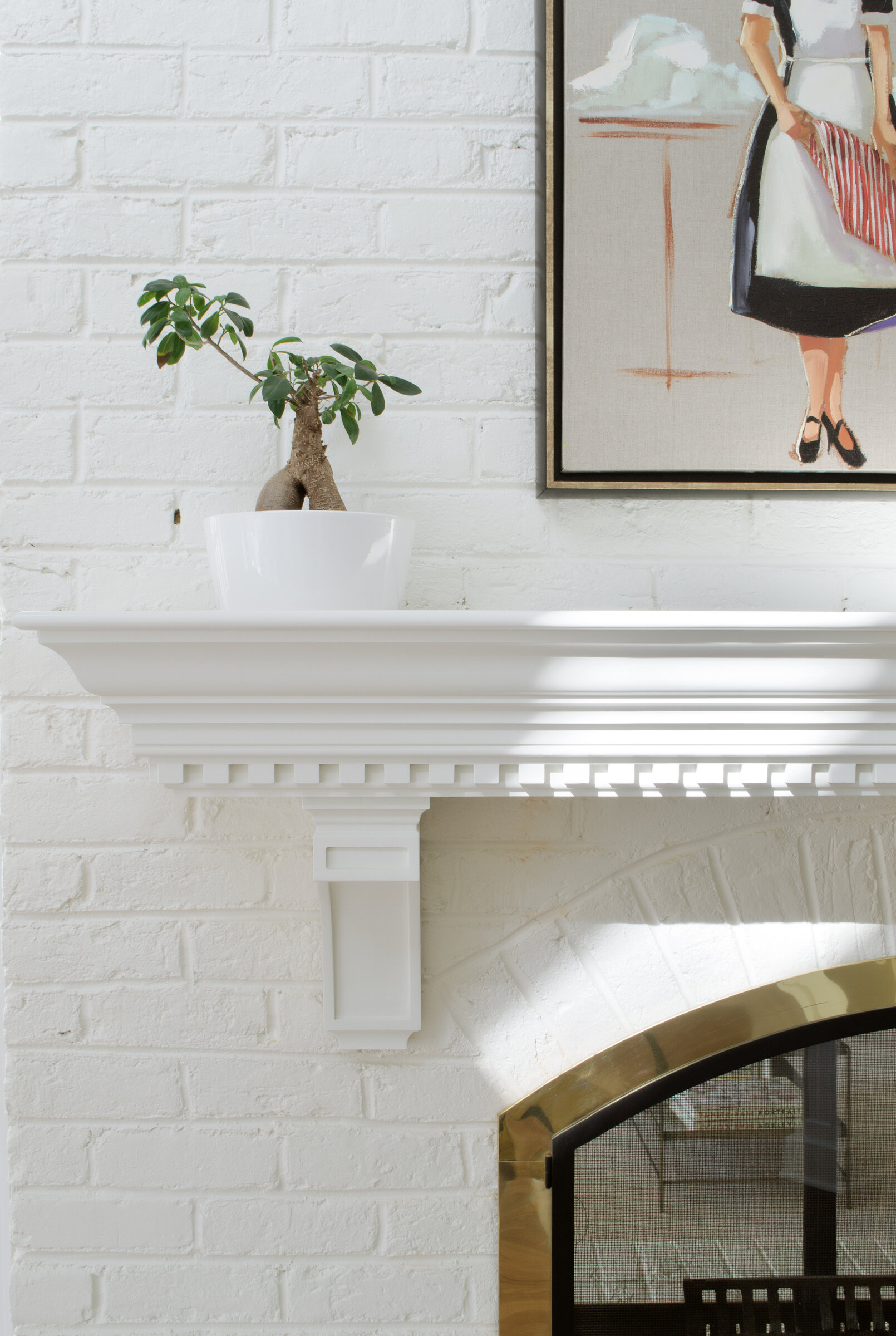
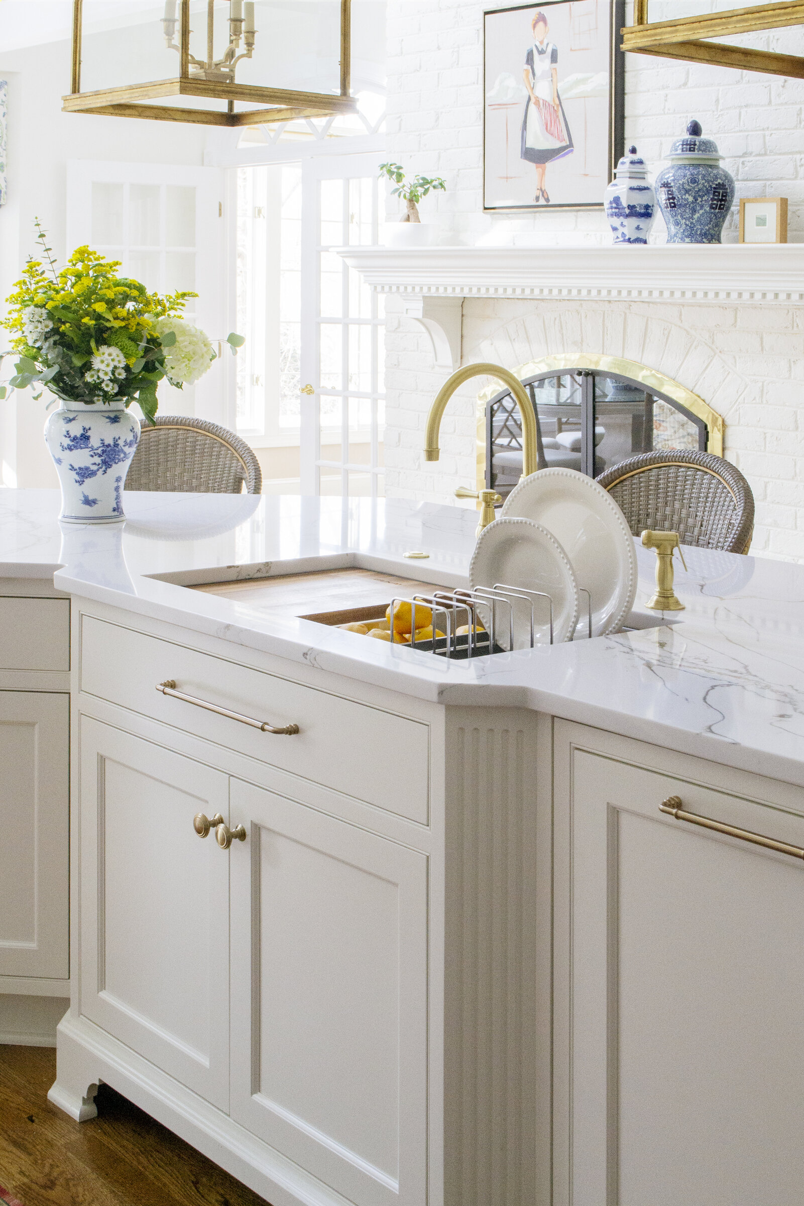
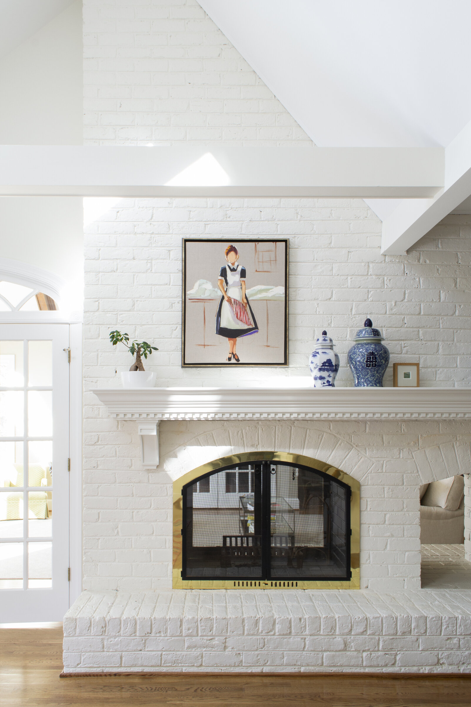
The island holds a paneled dishwasher, trash pull out, and large single bowl sink. The decorative valance along the sink base and the fluted panels call to the intricate beauty found throughout this kitchen, while the panel on the dishwasher ensures the space isn’t broken up by foreign textures. Custom Kitchens was also able to repair the existing mantle above the fireplace with identical molding to the cabinets, and added stately corbels for both style and substance. However, one of the most fun details about this kitchen- because who doesn’t get excited about organization?!- are the accessories the sink comes with. A cutting board, colander, and a plate rack optimize the sink and sit perfectly in the ledge.
See additional photos below.
