The Challenge
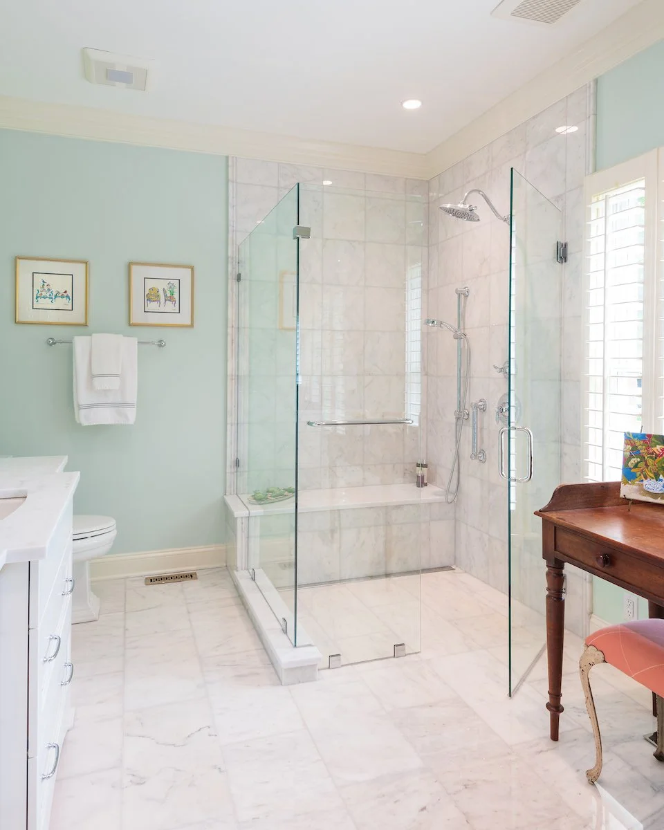
This primary bathroom, although functional, needed an upgrade. The window provided abundant natural light into the space but was blocked by the shower wall making the space look smaller and darker. The layout had obstacles that made moving in the space challenging. The second bathroom also needed a touch-up.
The Solution
Bumping out the sink adds a touch of elegance to the bathroom. The zero-entry shower was designed with aging-in-place in mind. Although the layout remained the same, it is the details (lights, hardware, toe valance, finishes, floor, tile) that this bathroom is transformed.
The bench with the ledge was a creative design solution to an electrical and plumbing issue. The initial design concept included a niche and a bench, however, once the tare-out started, the designer became aware of some obstacles that changed the idea.
This solution allows for the ledge to be used the same way a niche would be.
To maintain design consistency, the primary bathroom and second bathroom.
By removing the bathtub, the area became more spacious and the vanity became more readily accessible. The now-empty vanity space was the perfect place for a beautiful French armoire.
The shower is also zero-entry and aging-in-place mindful.


